Simon has completed a range Residential Building Design projects. Although these projects are theoretical, and will never be built they express capability and attention to detail in everything he does.


Simon has completed a range Residential Building Design projects. Although these projects are theoretical, and will never be built they express capability and attention to detail in everything he does.
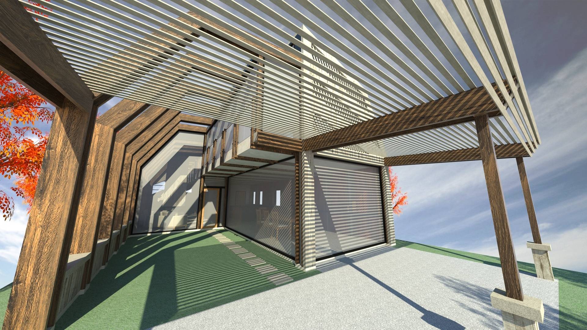
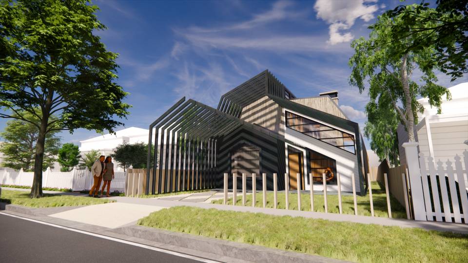
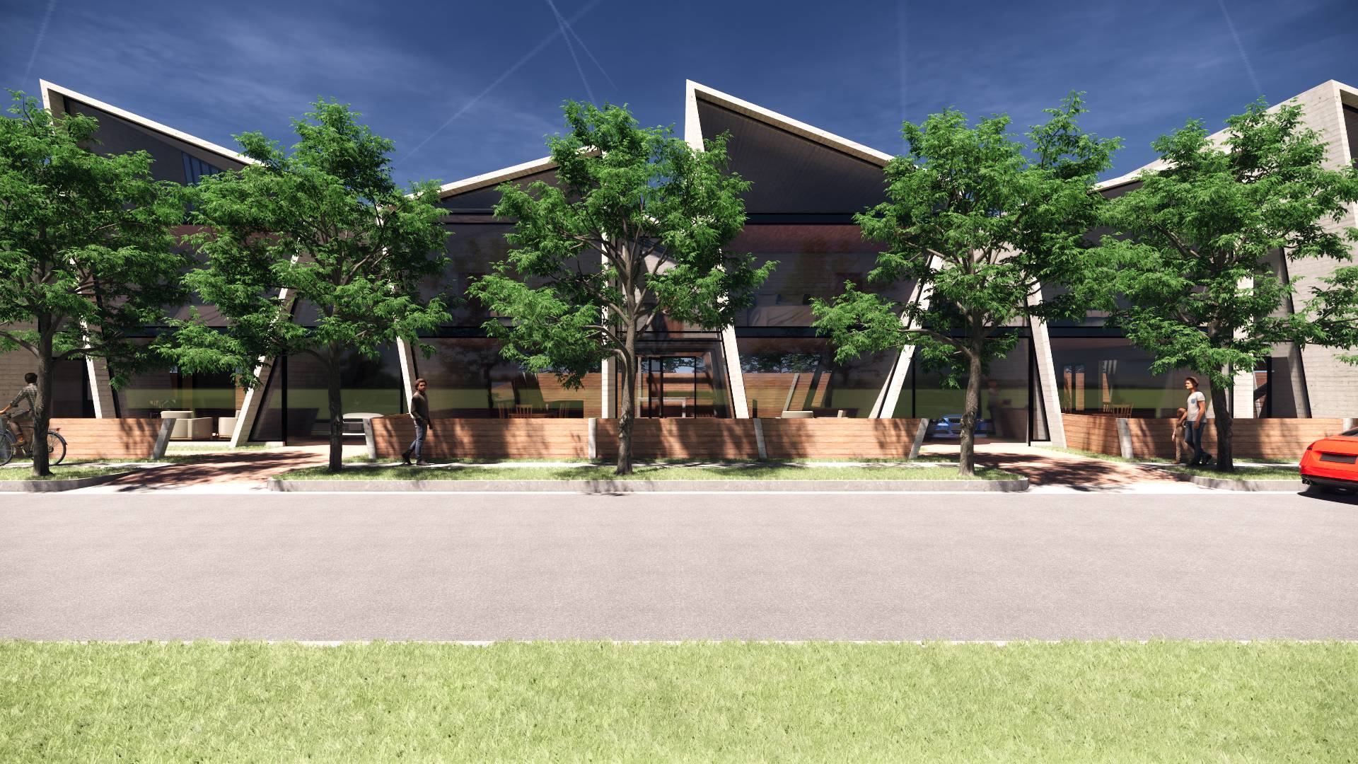
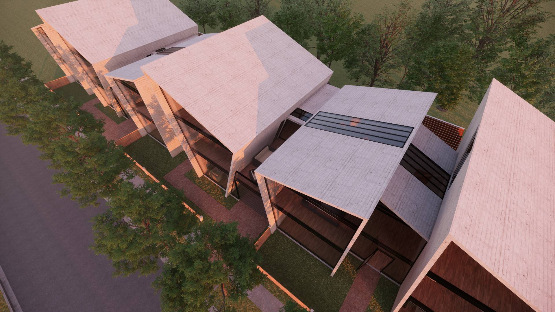
Located in Elstonwick the French street, this property will adopt the address of 56A Regent Street. The site is approximately 380m2 being approximately 38 metres deep and 10.06 metres wide.
"The partially shaded outer region of the shadow cast by an opaque object."

- Maximum allowable floor area of 230m2.
- Double Story Family Dwelling.
- Sustainability (Passive solar heating).
- Flexible open spaces suitable for children.
- Internal Storage solutions.
- Design that respects not replicates neighbours.
- Defined entrance into dwelling.
- Master with ensuite and walk in robe.
- Two kids rooms with room for them to grow.
- Study / Office / Library / Guest Room
- Space for 1 car to be parked off the road.
- Kitchen, Bathroom, Laundry, Living and Dining
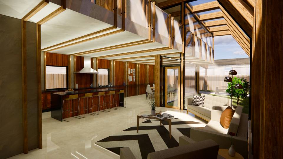
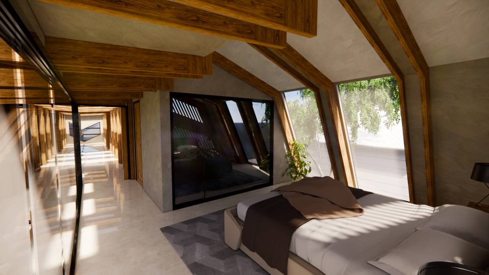
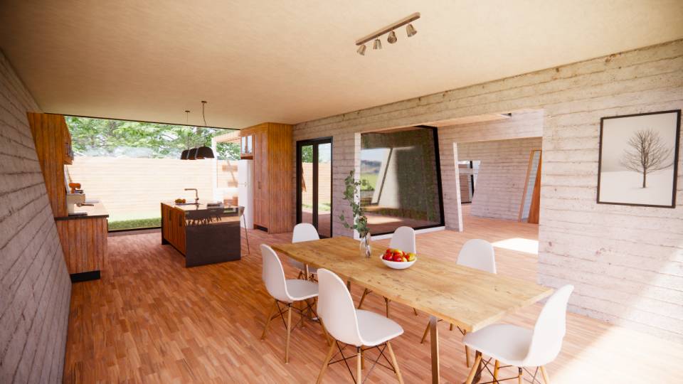
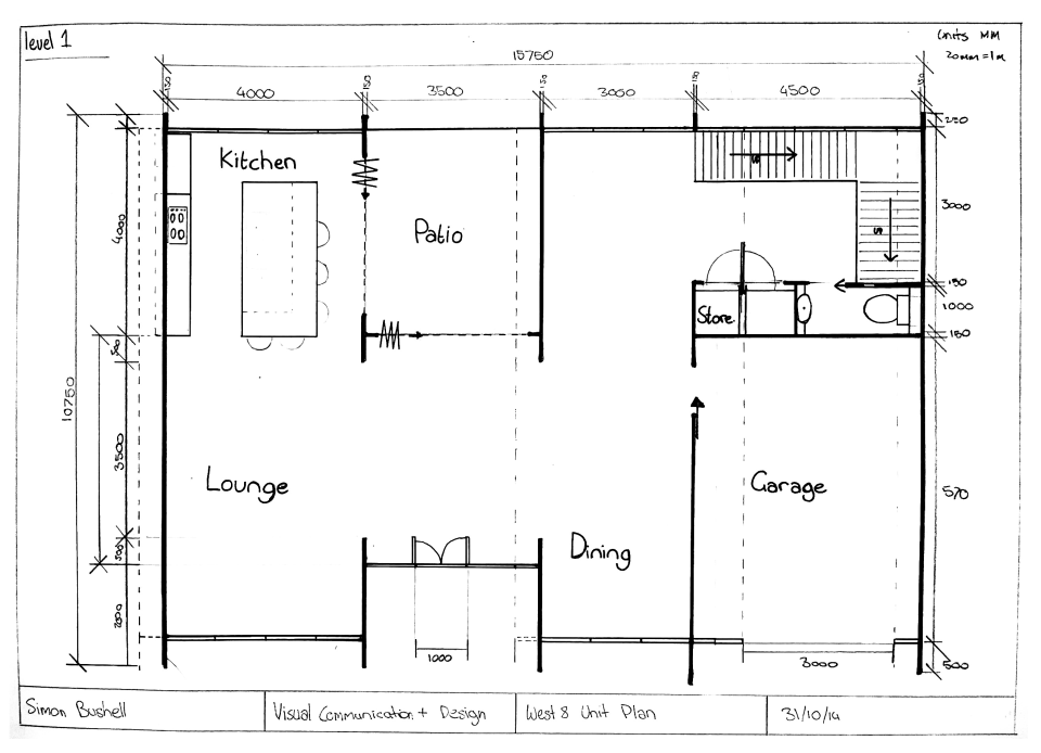
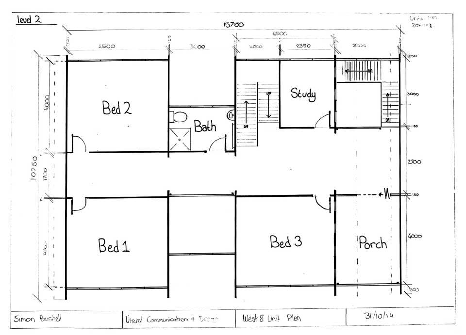
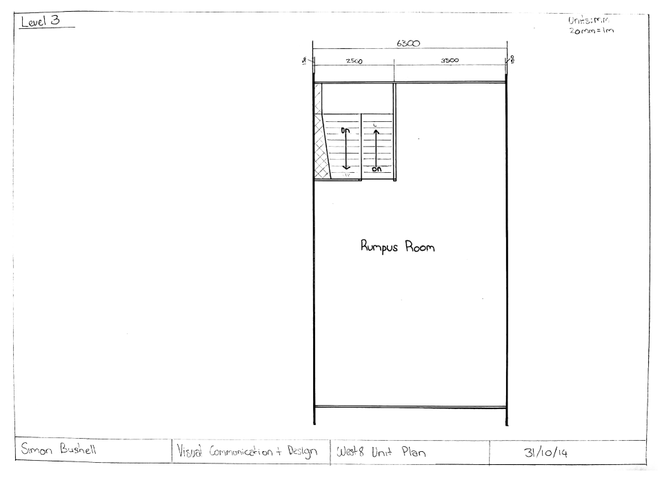
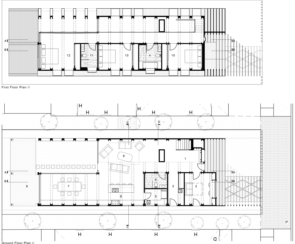
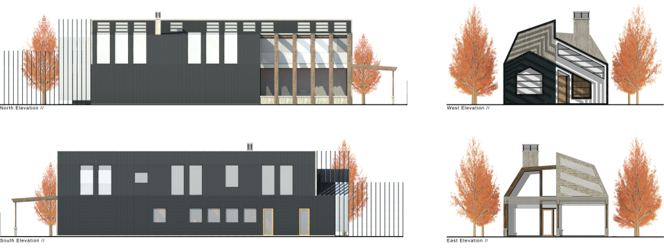
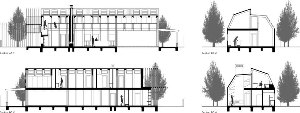
The final design includes open plan living on the ground floor with a living room that makes use of a double height void space. This enables the young children to be able to safely play in their rooms on the second floor without ever being out of earshot in any of the living, dining, kitchen or Laundry areas. The design incorporates a study / guest bedroom at the front of the house which has its own external door making if perfect for business use as well as for guests allowing them to have some privacy. Although all the private spaces are on first floor the design also incorporates another bathroom on the ground floor that is usable by guests whilst also allowing for mobility access that is otherwise restricted by the stairs that lead up to the second floor.
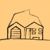
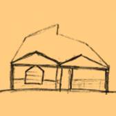
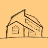
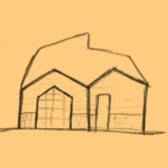
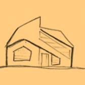
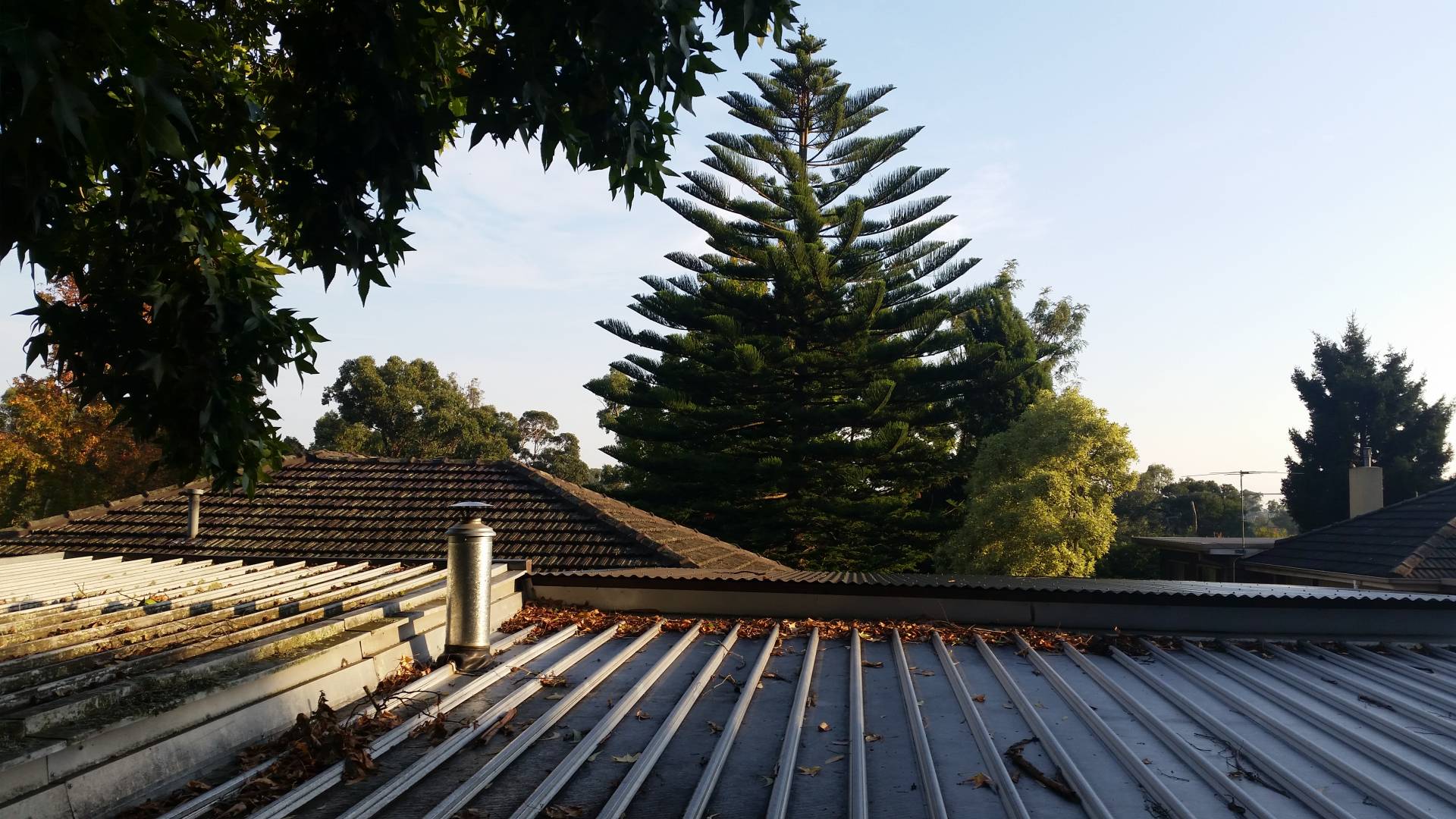
The production of the design outcome came through reviewing site and visiting the Melbourne museum to get research and ideas for a biomorphic design. From there I looked at the cicada, the bull-ant, the Rosella as well as gumtrees, and ferns. Because of the specific links of the cicadas to the site as well as the diversity in their potential design adaptations I made the decision to continue in that direction. To continue I completed the quick sketches of features such as façades, shading devices, and windows. That I could then progress into three dimensional concepts with SketchUp. To work out that best layout for the building the quick bubble diagrams were completed and I was able to look at how the ideas would work and function before progressing the best ideas to floor plans, this proved useful it allowed me to think about what spaced are best to have joint or used as connections. After this I was able to refine the most effective all elements into a final design.
“I’ve always been drawn to solitude, felt a kind of luxurious
relief in its self-generated pace and rhythms.”
- Caroline Knapp -
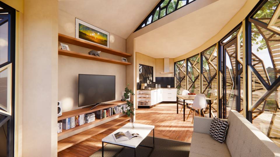
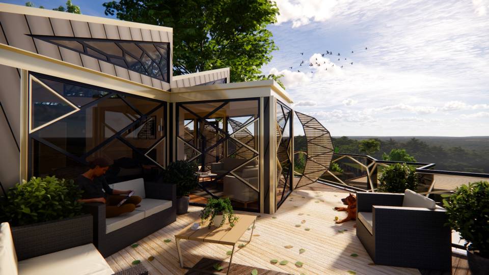
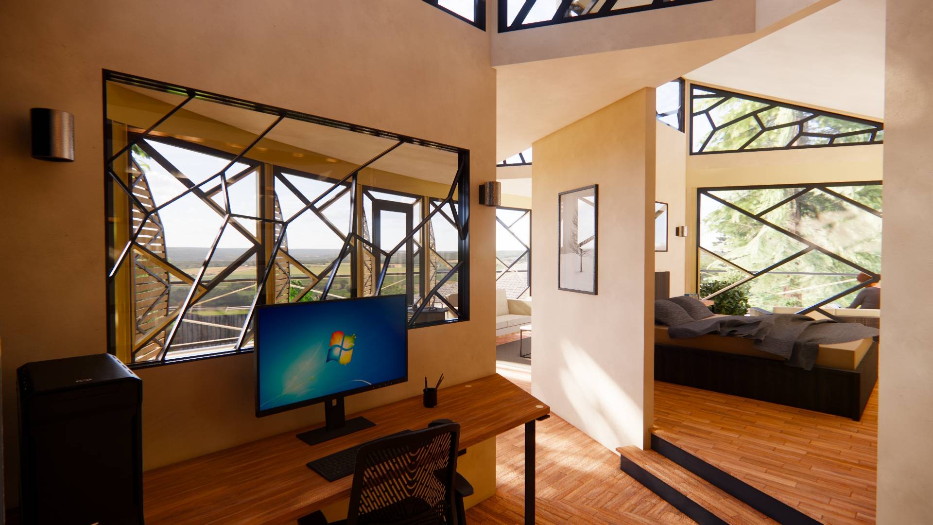
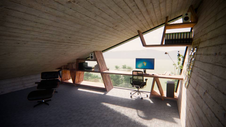
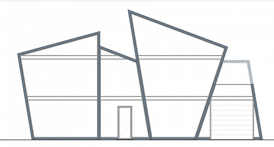
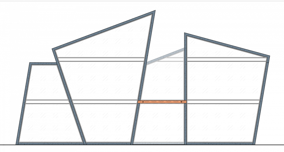
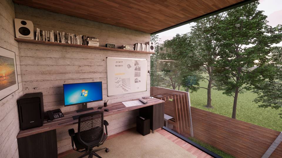
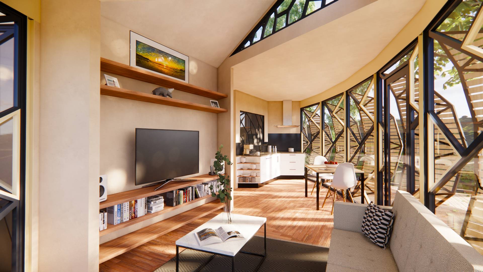
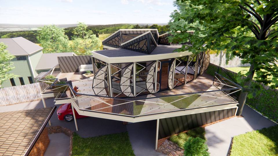
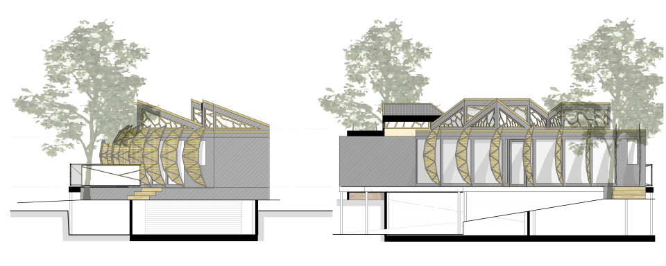
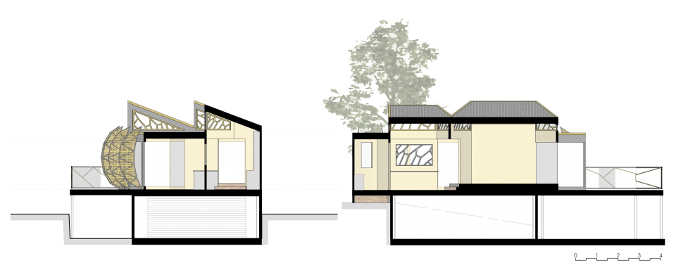
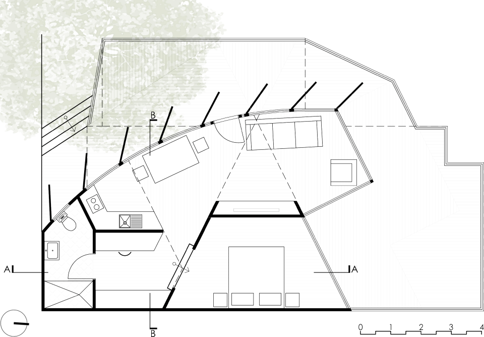
Located on top of the existing garage with outdoor areas covering all of the joining carports, the studio takes the form of the cicada wing. It is clad in dark grey vertically seamed aluminum cladding at a 20 degree angle, with arched louvres covering the glazing on the west side. The entire building adopts a ‘Black and Gold’ colour pallet inspired by many species of cicadas. Much like the way that the cicada wing is broken up the layout of the studio adopts various angles dividing up the space, the for of the areas is not just walls there is also use of floor cladding that runs perpendicular to other areas defining the floor space. Due to the sitting in the south west corner of the block, both the south and east faces are on the boundary in turn making it impossible to put windows in those two sides, for this reason I chose to put in sloped pop up roves that follow the division outlined on the floor. To bring the biomorphic elements back into this the framing for the glazing is the result of tracing over the bottom of a cicada wing with strait lines. The framing on the windows as well as the louvre frames work to not only be an element themselves but to also project their biomorphic shadowing throughout the inside of the studio creating beautiful patterns over different material combinations that will only be further enhanced when dappled light comes through the maple tree and into the studio. The studio also has the best views the site has to offer down the hill and onto all the trees that fill the area. This is all achieved while having generous spaces, all in 50 square metres.
